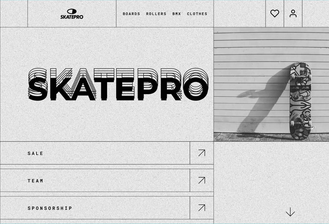
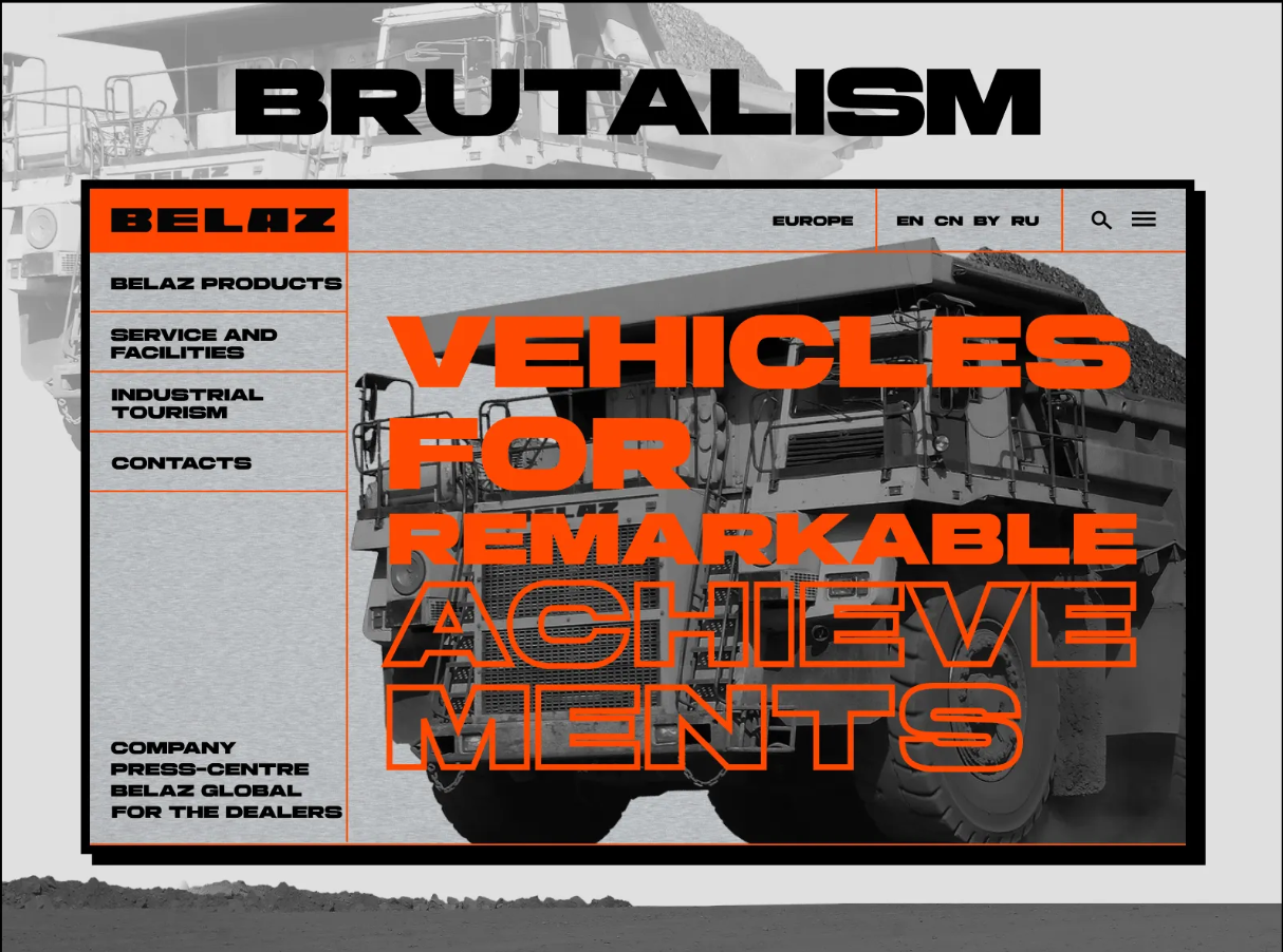
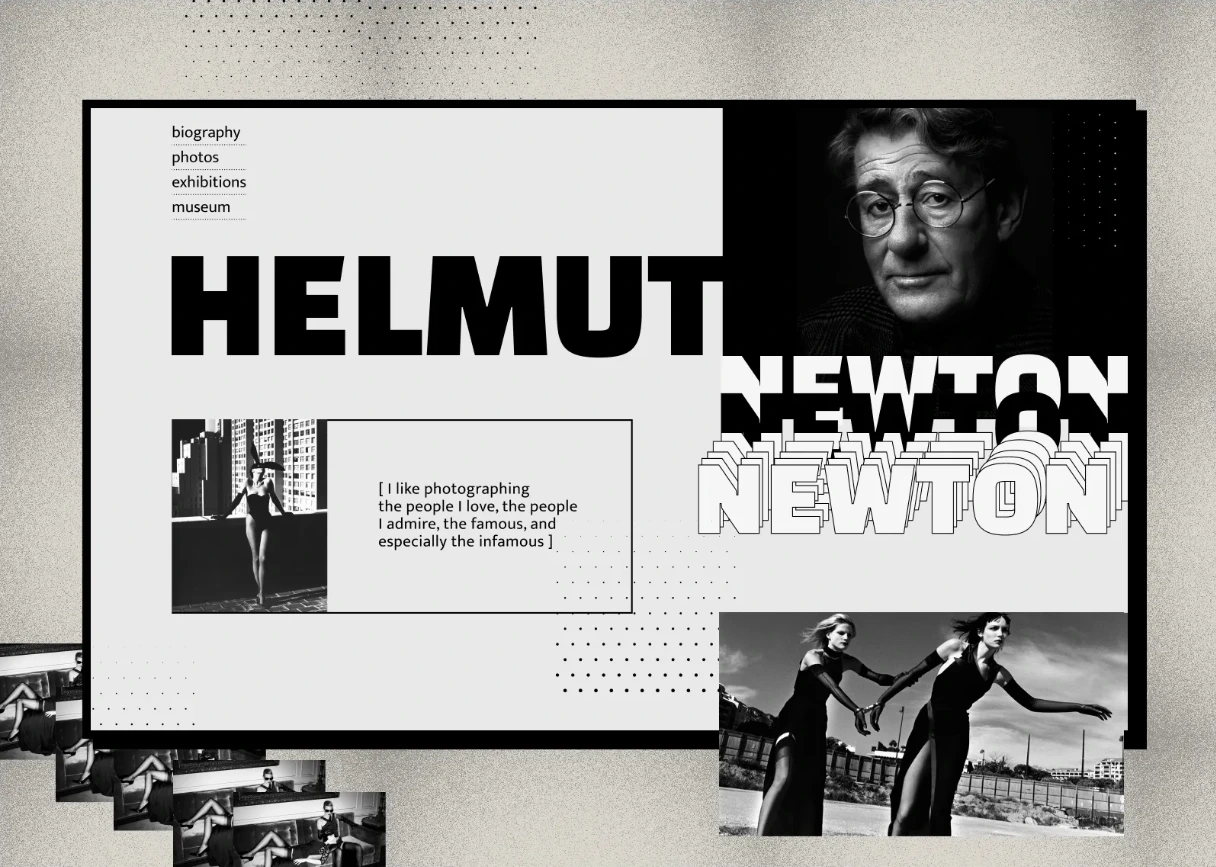
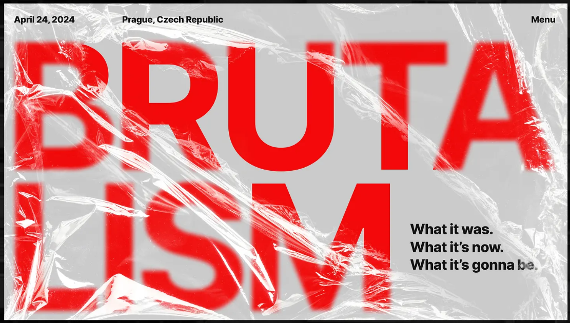
Brutalism UI Guide et outils CSS
Esthétique brute, industrielle et architecturale.
Massif, anguleux, fonctionnel, sans décoration.
Un style qui privilégie la structure, la matière et la lisibilité absolue.
Fonts
- 1. Helvetica
- 2. Inter Tight
- 3. Prompt
- 4. Anton
- 5. Roboto
- 6. Source Code Pro
- 7. Oswald
- 8. Google Sans Code
- 9. PT Mono
Palettes
#F6AE2D
#F26419
#F22719
#042EC4
#27514A
#FCFAF8
#0A0A0A
#926C48
#C1B09C
#E2E3DD
#D9DBDA
#ABB0B4
#737C83
#3F4042
UI Assets
Wall Paper
Bouton
background-color: #FCFAF856;
background-image:  linear-gradient(#00000088 1px, transparent 1px),
linear-gradient(90deg, #00000088 1px, transparent 1px),
linear-gradient(#00000088 0.5px, transparent 0.5px),
linear-gradient(90deg, #00000088 0.5px, #ebebf188 0.5px);
background-size: 25px 25px, 25px 25px, 5px 5px, 5px 5px;
background-position: -1px -1px, -1px -1px,
-0.5px -0.5px, -0.5px -0.5px;
border-right: 4px solid #FCFAF8;
border-bottom: 4px solid #FCFAF8;
box-shadow: 5px 5px 0px 1px #151009;
-webkit-backdrop-filter: blur(4px);
backdrop-filter: blur(4px);
Punch
Bouton
background-color: #F2F2F2;
background-image:
    repeating-linear-gradient(45deg, #000000 25%,transparent 25%,
    transparent 75%, #000000 75%, #000000),
    repeating-linear-gradient(45deg, #000000 25%, #ebebf1 25%,
    #ebebf1 75%, #000000 75%, #000000);
background-size: 10px 10px;
background-position: 0 0, 5px 5px;
border: 4px solid #000;
box-shadow: 14px 14px 0 #00000056;
color: #F26419;
Warning
Bouton
background-color: #F9F9F9;
background-image:
    repeating-linear-gradient(45deg, #000 0px, #000 6px,
    transparent 6px, transparent 12px);
border: 4px solid #000;
box-shadow: 12px 12px 0 #000;
color: #F22719;
font-size: 2rem;
letter-spacing: 2px;
Cabinet
Bouton
color: #042EC4;
font-style: italic;
background-color: #FCFAF8;
background-image:
    linear-gradient(#000 4px, transparent 4px),
    linear-gradient(90deg, #000 4px, transparent 4px);
background-size: 100% 30px, 30px 100%;
border-width: 2px 6px 6px 2px;
border-color: #000;
border-style: solid;
box-shadow: 6px 6px 0 #FCFAF8, 16px 16px 0 #000;
Collapse
Bouton
background-color: #ABB0B4;
border: 10px solid #D9DBDA;
box-shadow: 5px 5px 0px #000;
color: #3F4042;
transform: skew(-4deg);
Animation Assets
Translate
Hover me
cursor: pointer;
background-color: #FFF;
border: 6px double #000;
box-shadow: 8px 8px 0 #000;
transition: all 220ms ease;

:hover {
    background-color: #FCFAF8;
    border: 6px double #042EC4;
    box-shadow: 12px 12px 0 #000;
    color: #042EC4;
    transform: translate(-2px, -2px);
}
Cursor
Hover me
text-shadow: 4px 4px 0px rgba(37, 99, 235, 0.5);
cursor: url("data:image/svg+xml;utf8,
<svg xmlns='http://www.w3.org/2000/svg' width='14' height='14'>
    <rect width='14' height='14' fill='blue'/>
</svg>") 0 0, auto;
Roll On
Clic me
:active {
animation:
    roll-in
    0.65s
    cubic-bezier(0.230, 1.000, 0.320, 1.000)
     both;
}

@keyframes roll-in {
0% {
    transform:
      translateX(-1000px) rotate(-720deg);
    filter: blur(50px);
    opacity: 0;
}
100% {
    transform:
      translateX(0) rotate(0deg);
    filter: blur(0);
    opacity: 1;
}
}
Slide-in
animation:
    slide-in
    0.7s
    cubic-bezier(0.250, 0.460, 0.450, 0.940)
    both;
@keyframes slide-in {
    0% {
        transform:
          translateY(600px)
          rotateX(30deg)
          scale(0);
        transform-origin: 50% 100%;
        opacity: 0;
    }
    100% {
        transform:
          translateY(0) rotateX(0) scale(1);
        transform-origin: 50% -1400px;
        opacity: 1;
    }
}
Blurred
animation:
  blurred
  0.6s
  cubic-bezier(0.230, 1.000, 0.320, 1.000)
  both;
@keyframes blurred {
    0% {
        transform:
          translate(1000px, -1000px)
          skew(-80deg, -10deg);
        transform-origin: 0% 0%;
        filter: blur(40px);
        opacity: 0;
    }
    100% {
        transform:
          translate(0, 0)
          skew(0deg, 0deg);
        transform-origin: 50% 50%;
        filter: blur(0);
        opacity: 1;
    }
}
Vertical rotate
Clic me
animation:
  rotate-ver
  0.5s
  cubic-bezier(0.250, 0.460, 0.450, 0.940)
  both;
@keyframes rotate-ver {
    0% {
        transform: rotateY(-360deg);
        opacity: 0;
    }
    100% {
        transform: rotateY(0deg);
        opacity: 1;
    }
}
Horizontal rotate
Clic me
animation:
  rotate-hor
  0.5s
  cubic-bezier(0.250, 0.460, 0.450, 0.940)
  both;
@keyframes rotate-hor {
  0% {
    transform: rotateX(360deg);
    opacity: 0;
  }
  100% {
    transform: rotateX(0deg);
    opacity: 1;
  }
}
Hover 3D
Clic me
animation:
  pop-up
  0.5s
  cubic-bezier(0.250, 0.460, 0.450, 0.940)
  both;
@keyframes pop-up {
    0% {
        transform: translateY(0);
        transform-origin: 50% 50%;
        text-shadow: none;
    }
    100% {
        transform: translateY(50px);
        transform-origin: 50% 50%;
        text-shadow: 0 1px 0 #F6AE2D,
        0 2px 0 #F6AE2D, 0 3px 0 #F6AE2D,
        0 4px 0 #F6AE2D, 0 5px 0 #F6AE2D,
        0 6px 0 #F6AE2D, 0 7px 0 #F6AE2D,
        0 8px 0 #F6AE2D, 0 9px 0 #F6AE2D,
        0 50px 30px rgba(0, 0, 0, 0.3);
    }
}
Hover 3D
Hover me
animation:
  shadow-pop
  0.3s
  cubic-bezier(0.470, 0.000, 0.745, 0.715)
  both;
@keyframes shadow-pop {
  0% {
    box-shadow:
        0 0 #3e3e3e, 0 0 #3e3e3e,
        0 0 #3e3e3e, 0 0 #3e3e3e,
        0 0 #3e3e3e, 0 0 #3e3e3e,
        0 0 #3e3e3e, 0 0 #3e3e3e;
    transform:
      translateX(0) translateY(0);
  }
  100% {
    box-shadow:
        1px -1px #3e3e3e, 2px -2px #3e3e3e,
        3px -3px #3e3e3e, 4px -4px #3e3e3e,
        5px -5px #3e3e3e, 6px -6px #3e3e3e,
        7px -7px #3e3e3e, 8px -8px #3e3e3e;
    transform:
      translateX(-8px) translateY(8px);
  }
}
Créatif Assets
Cut-Out Hover
position: relative;
background-color: #F22719;
mask-image:
    linear-gradient(90deg, #000 60%, transparent 60%);
mask-size: 8px 100%;
mask-repeat: repeat;
transition: all 300ms steps(4, end);

::after {
    position: absolute;
    content: "bouton";
    top: 50%;
    text-align: center;
    color: #042EC4;
    opacity: 0;
    transform: translateY(-50%);
    transition: all 300ms linear;
}

:hover::after {
    opacity: 1;
}

:hover {
    transform: skew(-4deg) scale(1.12);
}
Robot Text Hover
ROBOT
opacity: 0;
transition: transform 0.05s steps(3, end);

:hover span {
    opacity: 1;
}

span:nth-of-type(1) {
    transition-delay: 0ms;
}
.robot-crea span:nth-of-type(2) {
    transition-delay: 100ms;
}
.robot-crea span:nth-of-type(3) {
    transition-delay: 200ms;
}
.robot-crea span:nth-of-type(4) {
    transition-delay: 300ms;
}
.robot-crea span:nth-of-type(5) {
    transition-delay: 400ms;
}