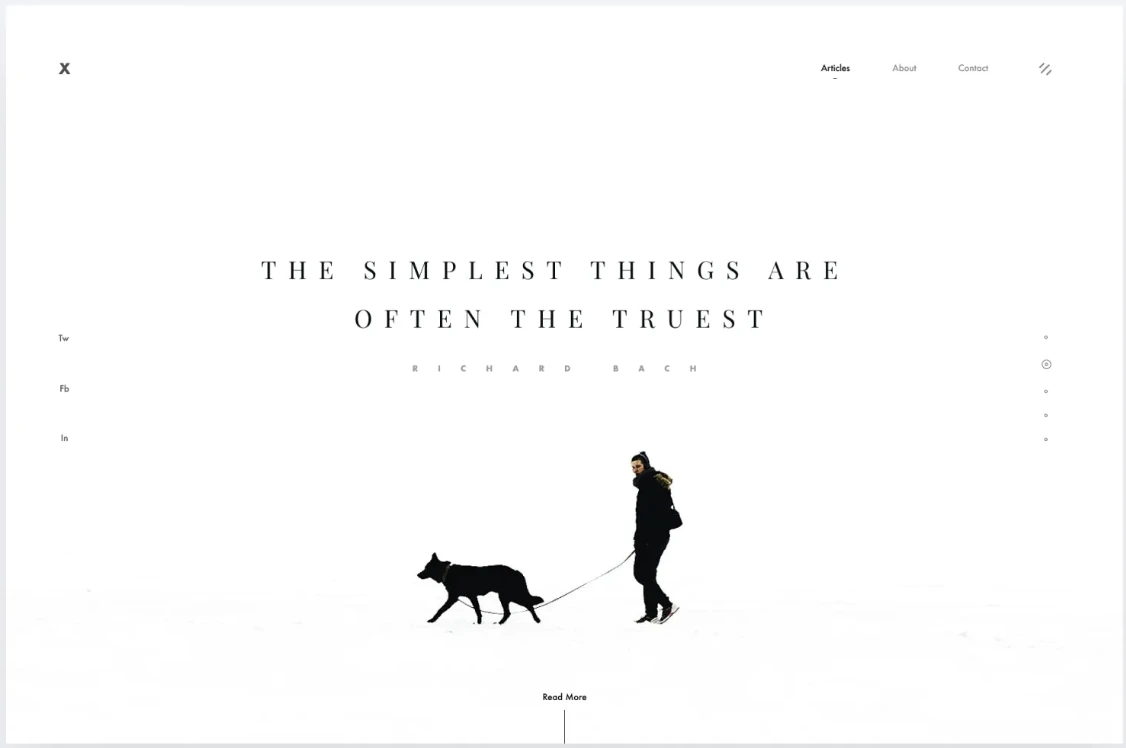
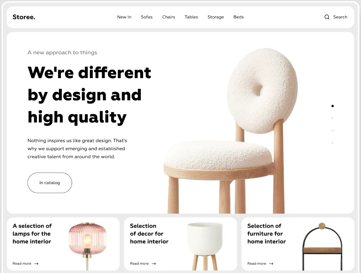
Minimalism UI Guide et outils CSS
Hiérarchie typographique claire, épuré, aucun remplissage inutile, palette neutre, formes simples.
Alignements parfaits, interlignage généreux, iconographie réduite et interactions discrètes.
Le minimalisme pur accepte 1 couleur forte, utilisée avec parcimonie.
Fonts
- 1. Inter
- 2. Montserrat
- 3. Roboto
- 4. IBM Plex Sans
- 5. Work Sans
- 6. Nunito
- 7. Poppins
- 8. Manrope
- 9. DM Sans
Palettes
#6FCF97
#2FA084
#1F6F5F
#EEEEEE
#C9D1D3
#D8D0C8
#E6DFD8
#F2EDE8
#F8DE22
#FD6A18
#18A0FB
#6C63FF
#A3A3F5
#FE81D4
#FCFAF8
#0A0A0A
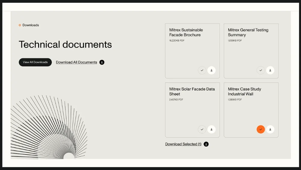
UI Assets
Classic Background
Bouton
background: #F9F9F9;
border: 1px solid rgba(0,0,0,0.12);
border-radius: 2px;
padding: 14px 22px;
color: #111;
Neutral Background
Bouton
background: #F2EDE8;
border: 1px solid rgba(255,255,255,0.08);
padding: 24px;
border-radius: 4px;
color: #FD6A18;
Classic Dark
Bouton
background: #0A0A0A;
color: #FCFAF8;
border-radius: 2px;
Hover Dark
Hover me
padding: 10px 18px;
border: 1px solid #000;
background: transparent;
color: #000;
border-radius: 4px;
transition: all 0.15s ease;

:hover {
    background: #000;
    color: #fff;
}
Hover Modern
Hover me
position: relative;
cursor: pointer;
background-color: #FFF;
border: 2px solid #0A0A0A;
border-radius: 8px;
transition: all 220ms ease;
z-index: 2;

::before {
    position: absolute;
    content: "";
    left: 0;
    top: 0;
    height: 100%;
    width: 0%;
    border-radius: 8px;
    background-color: #0A0A0A;
    transition: all 220ms ease;
    display: flex;
    align-items: center;
    justify-content: center;
    z-index: -1;
}

:hover {
    color: #FCFAF8;
    border: none;
}

:hover::before {
    width: 100%;
}
Gosth Text
Hover me
background: transparent;
color: #000;
border-radius: 4px;
transition: all 0.15s ease;

:hover {
  background: rgba(0,0,0,0.06);
}
Animation Assets
Text Border
Hover me
color: #000;
text-decoration: none;
border-bottom: 1px solid transparent;

:hover {
  border-bottom: 1px solid #000;
}
Cursor
Hover me
cursor: pointer;
font-weight: 500;
cursor: url("data:image/svg+xml;utf8,
<svg xmlns='http://www.w3.org/2000/svg' width='14' height='14'>
    <rect width='14' height='14' fill='blue'/>
</svg>") 0 0, auto;
Outline Dark
Clic me
outline: 4px solid #000;
outline-offset: 4px;
cursor: pointer;
transition: all 100ms ease;

:active {
    background: #000;
    color: #fff;
}
Hover Color
cursor: pointer;
transition: all 100ms ease;
color: #1F6F5F;
border: 4px solid #1F6F5F;

:hover {
    color: #2FA084;
    border: 4px solid #2FA084;
}
Text-entrance
CLIC ME,
Texte minimaliste animé.
A employer en entrée sur le site ou à l'ouverture d'une card ou modale
.animate {
    font-family: "Montserrat", sans-serif;
    height: auto;
    max-width: 400px;
    display: flex;
    flex-direction: column;
    gap: 1rem;
}
.animate-section:active .animate1 {
    animation: fadeInUp 0.6s both;
    animation-delay: 0.2s;
}
.animate-section:active .animate2 {
    animation: fadeInUp 0.6s both;
    animation-delay: 0.3s;
}

.animate-section:active .animate3 {
    animation: fadeInUp 0.6s both;
    animation-delay: 0.4s;
}
@keyframes fadeInUp {
    from {
        opacity: 0;
        transform: translateY(10px);
    }
    to {
        opacity: 1;
        transform: translateY(0);
    }
}
Hover 3D
Hover me
animation:
  shadow-pop-tr
  0.3s
  cubic-bezier(0.470, 0.000, 0.745, 0.715)
  both;
@keyframes shadow-pop-tr {
  0% {
    box-shadow:
        0 0 #3e3e3e, 0 0 #3e3e3e,
        0 0 #3e3e3e, 0 0 #3e3e3e,
        0 0 #3e3e3e, 0 0 #3e3e3e,
        0 0 #3e3e3e, 0 0 #3e3e3e;
    transform: translateX(0) translateY(0);
  }
  100% {
    box-shadow:
        1px -1px #3e3e3e, 2px -2px #3e3e3e,
        3px -3px #3e3e3e, 4px -4px #3e3e3e,
        5px -5px #3e3e3e, 6px -6px #3e3e3e,
        7px -7px #3e3e3e, 8px -8px #3e3e3e;
    transform: translateX(-8px) translateY(8px);
  }
}