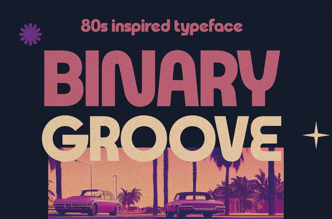
Retro 80s Post-Modern
Un style anti‑minimaliste, pop, rétro‑futuriste, inspiré des jeux d’arcade, des génériques TV 80s, du design kitsch.
Apparu dans les années 1980 avec le mouvement Memphis Milano.
Couleurs néon et pastel saturé, formes géométriques irrégulières, compositions chaotiques et anti‑grille, exagérée et répétitif.
Fonts
- 1. Bungee
- 2. Bungee Shade
- 3. Climate Crisis
- 1. Monoton
- 2. AudioWide
- 3. Gugi
- 1. Syncopate
- 2. Kanit
- 3. Bagel Fat One
Palettes
#FF00A8
#00E5FF
#FFD600
#FF6B00
#7C4DFF
#00FF85
#151515
#000000
#FFFFFF
#FFB3C6
#A0E7FF
#C3F584
#FFF5A5
#FF3F3F
#00A8F3
#FF8AE2
UI Assets
Classic Background
Background
background-color: #000000;
background-image:
    linear-gradient
    (90deg, rgba(255,255,255,0.15)
    1px, transparent 1px),
    linear-gradient
    (rgba(255,255,255,0.15)
    1px, transparent 1px);
background-size: 40px 40px;
Principal Title
Title
font-family: 'Bungee Shade', sans-serif;
font-size: clamp(4rem, 12vw, 14rem);
text-transform: uppercase;
line-height: 0.8;
color: #FF00A8;
text-shadow:
6px 6px 0 #00E5FF,
12px 12px 0 #FFD600;
letter-spacing: 0.02em;
margin: 0;
padding: 2vh 0;
Neon Button
Hover me
background: #FF00A8;
color: #FFFFFF;
padding: 1.2vh 3vh;
font-family: 'Bungee', sans-serif;
font-size: 2.4vh;
border: none;
cursor: pointer;
box-shadow: 6px 6px 0 #00E5FF;
transition: 0.15s ease;

:hover {
  transform: translate(-4px, -4px);
  box-shadow: 10px 10px 0 #FFD600;
}
Zig-Zag
Background
width: 100%;
height: 12px;
background: repeating-linear-gradient(
-45deg,
#FF00A8 0 10px,
#00E5FF 10px 20px
);

:hover {
    background: repeating-linear-gradient(
    45deg,
    #7C4DFF 0 10px,
    #00FF85 10px 20px
);
}
Pastel Memphis
Card
background: #FFF5A5;
padding: 4vh;
border: 4px solid #151515;
box-shadow:
8px 8px 0 #FF00A8,
16px 16px 0 #00E5FF,
24px 24px 0 #FFD600;
font-family: 'Kanit', sans-serif;
animation: colorBlink 360ms steps(8, start) infinite

@keyframes colorBlink {
    0% {
        color: #00E5FF;
    }
    50% {
        color: #FF00A8;
    }
    100% {
        color: #FFD600;
    }
}
Blob
 width: 180px;
height: 140px;
background: #00FF85;
border-radius: 60% 40% 70% 30% / 40% 60% 30% 70%;
box-shadow: 8px 8px 0 #FF6B00;
Pastel Pattern
background:
radial-gradient(#FF00A8 2px, transparent 2px) 0 0,
radial-gradient(#FF00A8 2px, transparent 2px) 10px 10px;
background-size: 20px 20px;
background-color: #A0E7FF;
padding: 4vh;
Simple Title
Titre
font-family: 'Bungee Shade', sans-serif;
font-size: clamp(3rem, 8vw, 10rem);
color: #FF00A8;
text-transform: uppercase;
line-height: 0.8;
Animation Assets
Neon Hover Text
Hover me
font-family: 'Audiowide', sans-serif;
font-size: 3rem;
color: #FFFFFF;
cursor: pointer;
transition: 0.1s ease;
Neon Pulse
Neon Texte
animation: neonPulse 1s infinite alternate;
@keyframes neonPulse {
  0% {
    text-shadow:
      0 0 6px #FF00A8,
      0 0 12px #FF00A8,
      0 0 18px #00E5FF;
  }
  100% {
    text-shadow:
      0 0 12px #FFD600,
      0 0 24px #FF00A8,
      0 0 36px #00E5FF;
  }
}
Colored Text
C
o
l
o
r
e
d
font-family: 'Inter', sans-serif;
font-weight: 700;
text-transform: uppercase;
line-height: 0.9;
cursor: pointer;
transition: all 200ms ease;

span:nth-of-type(1) {
    color: #FF00A8;
}
span:nth-of-type(2) {
    color: #00E5FF;
}
span:nth-of-type(3) {
    color: #FFD600;
}
span:nth-of-type(4) {
    color: #FF6B00;
}
span:nth-of-type(5) {
    color: #7C4DFF;
}
span:nth-of-type(6) {
    color: #00FF85;
}
span:nth-of-type(7) {
    color: #FF3F3F;
}

:hover span:nth-of-type(1) {
    color: #FFD600;
}
:hover span:nth-of-type(2) {
    color: #7C4DFF;
}
:hover span:nth-of-type(3) {
    color: #FF3F3F;
}
:hover span:nth-of-type(4) {
    color: #FF00A8;
}
:hover span:nth-of-type(5) {
    color: #00FF85;
}
:hover span:nth-of-type(6) {
    color: #FF6B00;
}
:hover span:nth-of-type(7) {
    color: #00E5FF;
}
Wiggle
display: inline-block;
:hover {
    animation: wiggle80s 0.25s infinite;
}

@keyframes wiggle80s {
  0% { transform: rotate(0deg); }
  25% { transform: rotate(2deg); }
  50% { transform: rotate(-2deg); }
  75% { transform: rotate(1deg); }
  100% { transform: rotate(0deg); }
}
Hover 3D
Hover me
background-color: #FFF;
font-family: "Kanit", sans-serif;

animation:
  shadow-pop
  0.3s
  cubic-bezier(0.470, 0.000, 0.745, 0.715)
  both;
@keyframes shadow-pop {
    0% {
        color: #FF00A8;
        box-shadow: 0 0 #00FF85, 0 0 #00FF85,
        0 0 #00FF85, 0 0 #00FF85;
        transform: translateX(0) translateY(0);
    }
    50% {
        color: #7C4DFF;
        box-shadow:
            1px -1px #7C4DFF,
            2px -2px #7C4DFF,
            3px -3px #7C4DFF, 4px -4px #7C4DFF;
        transform:
            translateX(-4px) translateY(4px);
    }
    100% {
        color: #00FF85;
        box-shadow:
            1px -1px #FF00A8, 2px -2px #FF00A8,
            3px -3px #FF00A8, 4px -4px #FF00A8,
            5px -5px #FF00A8, 6px -6px #FF00A8,
            7px -7px #FF00A8, 8px -8px #FF00A8;
        transform:
            translateX(-8px) translateY(8px);
    }
}
Memphis Pop
Hover me
:hover {
  animation: pop80s 0.35s cubic-bezier(.26,1.52,.46,.92);
}
@keyframes pop80s {
  0% { transform: scale(0.4); opacity: 0; }
  70% { transform: scale(1.15); opacity: 1; }
  100% { transform: scale(1); }
}
Neon Scan
Scan
position: relative;
overflow: hidden;

::after {
  content: "";
  position: absolute;
  top: 0;
  left: -100%;
  width: 100%;
  height: 100%;
  background:
   linear-gradient(90deg, transparent, #FF00A8, transparent);
  animation: slideNeon 1.4s infinite;
}

@keyframes slideNeon {
  0% { left: -100%; }
  100% { left: 100%; }
}
Créatif Assets
Waves
width: 200px;
height: 20px;
background: url("data:image/svg+xml;utf8,
<svg width='200' height='20' xmlns='http://www.w3.org/2000/svg'>
<path d='M0 10 L30 0 L60 20 L90 0 L120 20 L150 0 L180 10'
        stroke='%23FF6B00' stroke-width='6' fill='transparent'/>
</svg>");
filter: drop-shadow(6px 6px 0 #00E5FF);
Flicker
NEON
animation: vhsFlicker 0.08s infinite alternate;

@keyframes vhsFlicker {
  0% { opacity: 0.92; transform: skewX(0deg); }
  100% { opacity: 1; transform: skewX(1deg); }
}
Massive Number
33
font-family: 'Bungee', sans-serif;
font-weight: 900;
font-size: clamp(6rem, 20vw, 25rem);
color: #FFF5A5;
text-shadow: 5px 5px 0 #FFD600, 10px 10px 0 #FFD600;
line-height: 0.8;
text-transform: uppercase;